Introduction
Colours silently control how we feel at home. A soft, soothing bedroom can help you unwind after a long day, while a bright, cheerful living room can instantly lift the mood of everyone who walks in. That is why choosing the right bed room colour combinations and best colour inside house is not just a design decision, it is an emotional one.
In most Indian homes, we balance tradition and modern style. We want warm, welcoming shades for guests, calmer tones for prayer and study, and slightly luxurious finishes for master bedrooms. At the same time, we have to think about practical factors – dust, humidity, children’s scribbles, and changing furniture over the years.
This guide brings together colour psychology, Indian light conditions, and real apartments and villas, not just catalogue photos. Room by room, we will help you understand which shades work where, how to combine two or three colours nicely, and how to avoid mix-and-match mistakes that many homeowners regret later.
Why Colour Selection Matters Inside a Home
Colour is the first thing your eye notices, even before furniture or décor. A well-planned palette can make a small 2BHK feel airy, a busy living room feel calm, and a bedroom feel instantly relaxing. That is why choosing the best colour inside house is closely linked to mood, productivity, and daily comfort.
Soft, muted shades in bedrooms reduce visual noise and help your mind slow down before sleep. Slightly energetic tones in the living room encourage conversation and make guests feel welcome. Study corners and work-from-home spaces benefit from fresh, focused colours that keep you alert without feeling harsh.
Paint shades also change how we read space. Light colours push walls out visually, making compact rooms in city apartments look bigger. Deeper accent colours, used on just one wall or niche, add depth and interest without making the room feel heavy. Natural light matters too – what looks cool grey in a catalogue may look blue in a north-facing room or dull in a low-light corridor.
Finally, colour is a long-term investment. When you pick a timeless base palette and layer trends only through cushions, curtains, and décor, your home continues to look updated for many years with very little repainting cost.
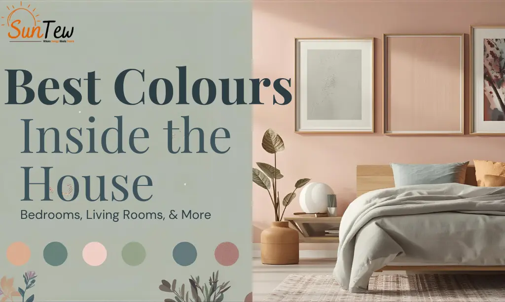
Trending Bed Room Colour Combinations for Modern Homes

Bedrooms need calm first, style second. The smartest bed room colour combinations balance soft base shades with one or two accent tones so the room feels peaceful, not busy. Here are three practical ways to plan your bed room colour paint in real Indian homes.
Soft Neutral Bedroom Colour Paint Ideas
If you like clean, hotel-like rooms, start with neutrals. Shades of beige, ivory, off-white, and very light grey are timeless and easy to maintain. They work beautifully in compact city bedrooms and rented flats where you may change furniture often.
Paint three walls in a soft neutral and keep the ceiling white so the room feels taller and brighter. You can then add colour through bedsheets, cushions, and curtains instead of committing to loud walls. Warm white lights and simple wooden furniture pair very well with these palettes, giving you a calm, uncluttered space that suits almost any décor style.
Warm Colour Combinations for Cozy Bedrooms
For a more cozy feel, choose warm tones that still stay gentle on the eyes. Peach, muted terracotta, biscuit, sand, and warm taupe are some of the best wall colours for bedrooms that need comfort and character.
You can paint one main wall behind the bed in a soft peach or terracotta and keep the other walls a light cream. This combination adds depth without shrinking the room. Warm colours work especially well in north- or east-facing bedrooms that feel a bit cool in the mornings. Paired with soft lamps, textured cushions, and a rug, the room feels instantly more inviting.
Bold & Luxury Bedroom Colour Combinations
If you enjoy a richer, boutique hotel vibe, you can still use deeper colours in a controlled way. Deep teal, charcoal grey, emerald, wine, or midnight blue on a single accent wall can look very premium when balanced with light surrounding walls.
For example, create a bold headboard wall in deep teal with the rest of the room in warm off-white. Add brass or black metal fixtures, simple artwork, and solid-colored curtains instead of heavy prints. Textured finishes, paneling, or subtle metallic paints used only on the accent wall can give your bedroom a luxury feel without making it dark or overwhelming.
Best Wall Colours for Bedrooms Based on Room Type
Master Bedroom Colour Ideas
In a master bedroom, you want calm plus a hint of sophistication. Soft greys with a beige undertone, muted sage green, warm greige (grey & beige), or pale taupe work very well. These shades feel restful at night and still look elegant in daylight. You can keep three walls in a light neutral and use a slightly deeper version of the same colour behind the bed. This layered approach adds depth without feeling loud, and it also works nicely with wood, fabric headboards, and metal lamps.
Kids Bedroom Colour Paint Options
For kids, avoid extremely bright primary colours on all walls – they can overstimulate and quickly feel tiring. Instead, use softer versions like pastel blue, mint, lavender, butter yellow, or blush pink on two walls and keep the others white or off-white. Fun can come through wall stickers, posters, and bedding, which you can easily change as they grow. If siblings share a room, pick a gender-neutral base such as mint or light aqua and let each child personalize their side with accessories.
Guest Bedroom Colour Combinations
Guest bedrooms should feel neutral, clean, and welcoming for any age group. Light beige, warm white, soft dove grey, or a pale green are safe and stylish options. You can introduce interest with one accent wall in a slightly deeper tone or a subtle textured paint behind the bed. Avoid very dark or experimental colours here, since guests may have different preferences. Soft colours combined with fresh linens, two good pillows, and warm bedside lighting will make even a compact guest room feel like a comfortable stay.
Paint Colors for Living Room That Elevate Your Space
Your living room is where guests form their first impression of your home, so paint colors for living room should feel bright, welcoming, and easy to style in different ways over time. Instead of chasing trends blindly, think about room size, natural light, and the kind of mood you want – relaxed family zone, a formal sitting room, or a mix of both.
Light Living Room Colours for Small Homes
For compact flats or halls with limited natural light, choose soft, light shades that bounce light around. Off-white, light beige, pale grey, soft sand, or very light pastel green work beautifully. When you paint all four walls in a light tone and keep the ceiling pure white, the room immediately looks bigger. These colours also make it easier to use colourful cushions, carpets, and artwork without the space looking cluttered.
Modern Living Room Colour Trends
If you like a modern, slightly urban look, try cool greys with a touch of warmth, muted sage, greige, or soft taupe. Use one accent wall in a deeper shade of the same colour behind the TV unit or sofa and keep the remaining walls lighter. This tone-on-tone layering gives a clean, contemporary feel without becoming too edgy. Pair with sleek furniture, black or brass lights, and simple artwork for a complete look.
Traditional Indian Living Room Colour Ideas
For homes that host poojas, festivals, and family gatherings often, warm and rich palettes feel more natural. Cream with a mustard or ochre accent wall, beige with a soft maroon niche, or pistachio green with wooden furniture are classic Indian combinations that never go out of style. These shades look beautiful with brass decor, wooden swings, temple corners, and colourful rangolis during festivals, giving your living room a rooted, homely charm.
Best Colour Inside House – Room-by-Room Guide
Choosing the best colour inside house becomes easier when you break it down room by room. Each space has its own mood, light, and use, so it deserves its own palette instead of one single shade everywhere.
Kitchen Colour Ideas
In Indian homes, the kitchen is active from early morning to late night, so it should feel fresh and be easy to clean. Soft whites, light greys, pale mint, or light beige work very well as wall colours. They make the space look hygienic and help cabinets, tiles, and utensils stand out clearly. Avoid very dark shades on all walls, because they can make a compact kitchen feel smaller and show oil marks more easily. If you want some energy, add a coloured backsplash or one accent wall in soft yellow, aqua, or pistachio.
Dining Area Colour Combinations
The dining area is all about warmth and togetherness. Warm neutrals like beige, cream, sand, or very soft terracotta create a cozy backdrop for family meals. You can also try a two colour combination – for example, three walls in light cream and one wall in a deeper coffee or muted rust behind the dining console. These tones look beautiful with wooden tables, brass décor, and warm pendant lights, and they photograph well during festivals and celebrations.
Bathroom Colour Trends
Bathrooms look best when they feel clean and calm. Light blues, sea green, pale grey, and warm white are safe choices. They reflect light, make small bathrooms look bigger, and pair nicely with white or beige tiles. You can add interest with a slightly deeper shade in the shower niche or behind the mirror. Avoid very dark colours on all walls in small bathrooms, as they can make the space feel cramped and dull.
How to Choose the Right Interior Colour Combination
The best colour plan always starts with your actual home, not just Pinterest photos. First, observe the lighting in each room – which walls get direct sunlight, which stay in shadow, and how the space looks in the evening with tube lights or warm ceiling lights. Test your chosen shades on a small patch and see them at different times of day before finalizing.
Next, look at your furniture and flooring. If you already have dark wood furniture, deep sofas, or patterned tiles, keep wall colours softer so the room doesn’t feel heavy. If your furniture is light and simple, you can afford slightly richer accent shades. Try to connect colours across rooms so the house feels like one story instead of unrelated blocks.
Wall finish selection also matters. Matt finishes hiding minor wall undulations and looks premium in bedrooms and living rooms, while washable or soft sheen paints are better for kids’ rooms, kitchens, and high-traffic areas.
Many Indian families also consider Vastu, or directional balance. Even if you are not strict about it, soft earthy and pastel tones in bedrooms, light, bright shades in living and study areas, and calm neutrals in pooja spaces generally feel harmonious and are easy to maintain.
Common Mistakes to Avoid When Choosing Interior Paint Colours
One of the biggest mistakes homeowners make is choosing paint shades only from a tiny brochure or mobile screen. Colours look very different on real walls with your lighting and flooring, so always test a small patch first.
Another common error is using too many strong colours in a single flat – a dark feature in every room, plus bright ceilings or doors. This breaks visual flow and makes the house feel smaller and more cluttered. Pick one or two highlight areas and keep the rest calm.
People also forget about finishing. High-sheen paints on imperfect walls can highlight every patch and crack. In most bedrooms and living rooms, a smooth matte or low-sheen finish works much better.
Finally, rushing decisions to “finish painting quickly” often leads to regret. Take one extra day to coordinate wall colours with sofas, curtains, and wardrobes. A little planning here saves years of feeling unhappy with the look of your home.
Why Professional Colour Consultation Makes a Difference
Online photos and shade cards are a good start, but they cannot fully predict how a colour will behave on your actual walls, with your light, furniture, and flooring. A professional colour consultation brings that missing real-world experience into the decision.
An expert from Suntew looks at your home as a whole – room sizes, natural light, ventilation, existing furniture, tiles, and even your long-term plans. Instead of suggesting random trendy shades, they build a simple, connected palette that flows from living room to the bedrooms, kitchen, and balconies without clashes.
Professionals also help you choose the right paint finish, highlight walls, and select texture options and durable products for high-use areas like kids’ rooms and kitchens. Most importantly, they listen to your taste and comfort level, then translate it into a practical colour plan that will still look good 5 to 7 years from now. This saves you repainting costs and post-renovation regret.
Ready to Transform Your Home with the Perfect Colours?
Ready to repaint your home but confused about shades and combinations? Let Suntew turn that confusion into a clear, room wise colour plan that fits your space, light, and lifestyle. Our interior experts help you choose the best colours inside the house for bedrooms, living rooms, kitchens, and more, with practical suggestions you can actually implement. Book a free colour consultation with Suntew and get personalized guidance, product suggestions, and a smooth execution plan. Visit our contact page to get started today and see how colour can transform your home. https://suntew.com/contact-us